In this article I will present a short Fusion + CSS solution that I built into several customer projects to make the content areas more accessible.
The solution
First override the ContentCollection Fusion prototype to render its node name into a CSS variable via its style attribute (but only while in backend):
prototype(Neos.Neos:ContentCollection) {
    attributes {
        style = ${'--collection-label: "Add content to \"' + node.label + '\""'}
        style.@if.inBackend = ${node.context.inBackend && node.context.currentRenderingMode.edit}
    }
}
Next, add the following styles to your (backend-only) stylesheet:
.neos-backend {
  .neos-contentcollection [class*="_addEmptyContentCollectionOverlay"] {
    cursor: pointer;
    height: 41px;
    text-align: right;
    text-overflow: ellipsis;
    white-space: nowrap;

    &::before,
    &::after {
      display: inline-block;
      color: #adadad;
      opacity: 0.5;
      transition: opacity 0.2s ease;
      line-height: 41px;
    }

    &::after {
      margin: 0 1rem;
      content: "\21e7";
      animation: empty-collection-arrow 2.5s infinite 2s;
    }

    &::before {
      content: var(--collection-label, "Add content");
    }

    &:hover {
      &::before,
      &::after {
        opacity: 1;
      }
    }
  }
}
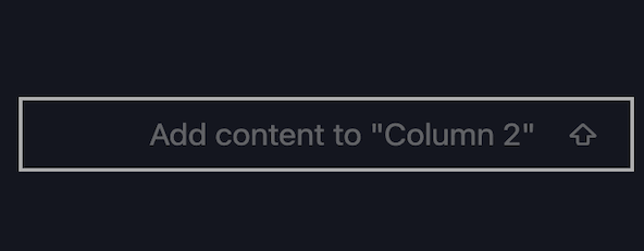
Then it should look something like this:
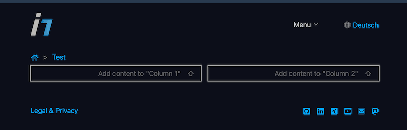
The clickable area is now bigger and the placeholder shows which area you are actually selecting.
Make sure to adjust your CSS to not render an empty collection higher than 20px, as the Neos.Ui would hide the placeholder in this case.
Additional notes
I finalised the feature to give child nodes custom labels in their parent definitions in Neos 8.4 and 9.0. Meaning for multi column elements, you don't have to necessarily create custom nodetypes for the columns to achieve speaking labels:
'Neos.Demo:Content.Columns.Two':
  superTypes:
    'Neos.Neos:Content': true
  ui:
    label: 'Two columns'
  childNodes:
    column0:
      label: 'Left column'
      type: 'Neos.Neos:ContentCollection'
    column1:
      label: 'Right column'
      type: 'Neos.Neos:ContentCollection'
Summary
That's it. I hope you can make the editors in your project with this a bit happier, as I was able to.
It's always good to let editors show how they work to see usability issues in the backend. I recognised this topic a few times, when they tried to add content to the correct container elements. So I improved the element to have better labels and to show them when they are empty.